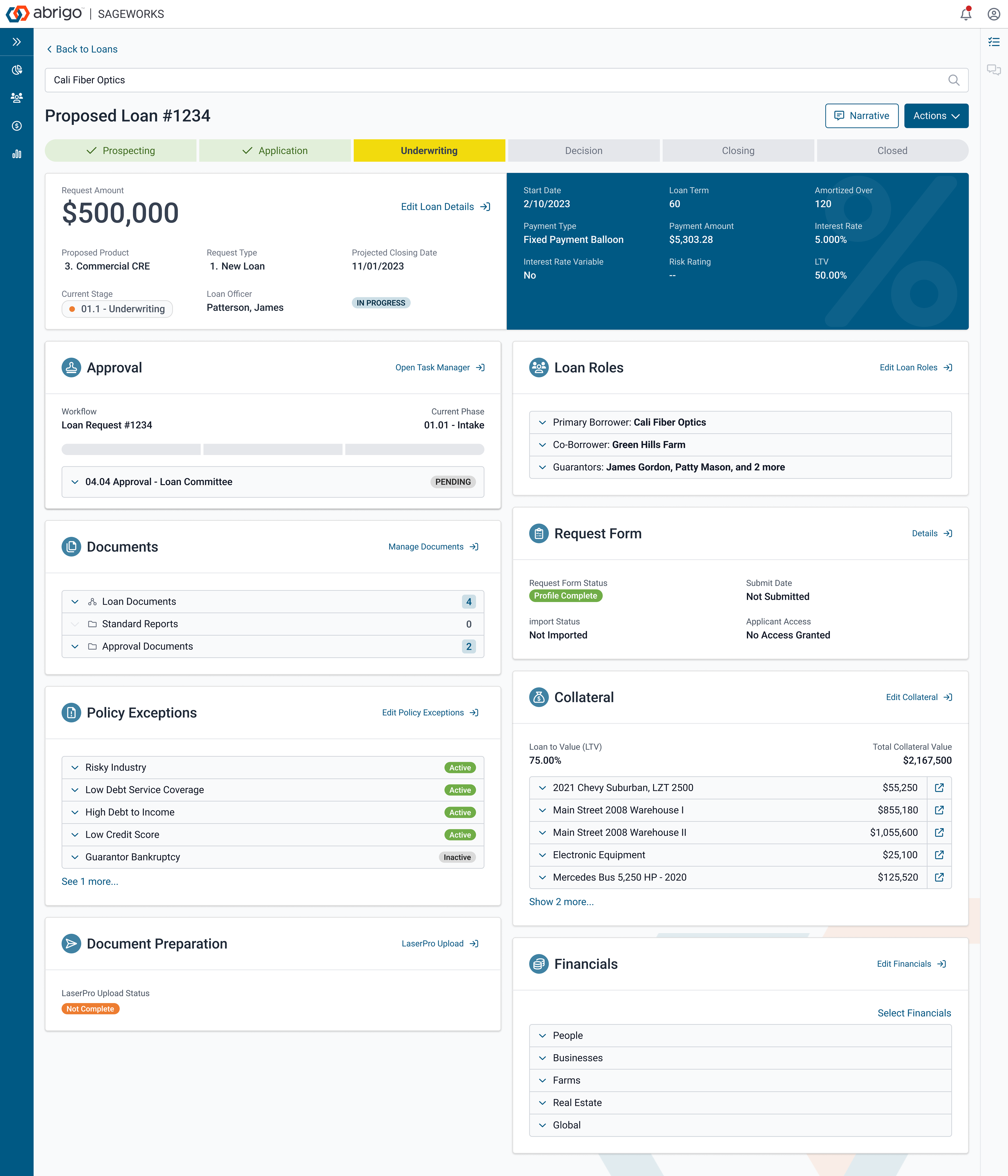
Below is a design example of a summary. Users will find the most important pieces of information about a loan in the form of cards placed in different areas of the page. Admin roles can set different templates for each institution depending on the needs of their users. From each card, users can click to view more details or edit data as needed. You will see multiple UI elements on this page that I have designed for progress reporting and status reporting to the user, you will find information structures for each type of data. This UI was tested aggressively to make sure it covers the needs of a wide range of users and functions.
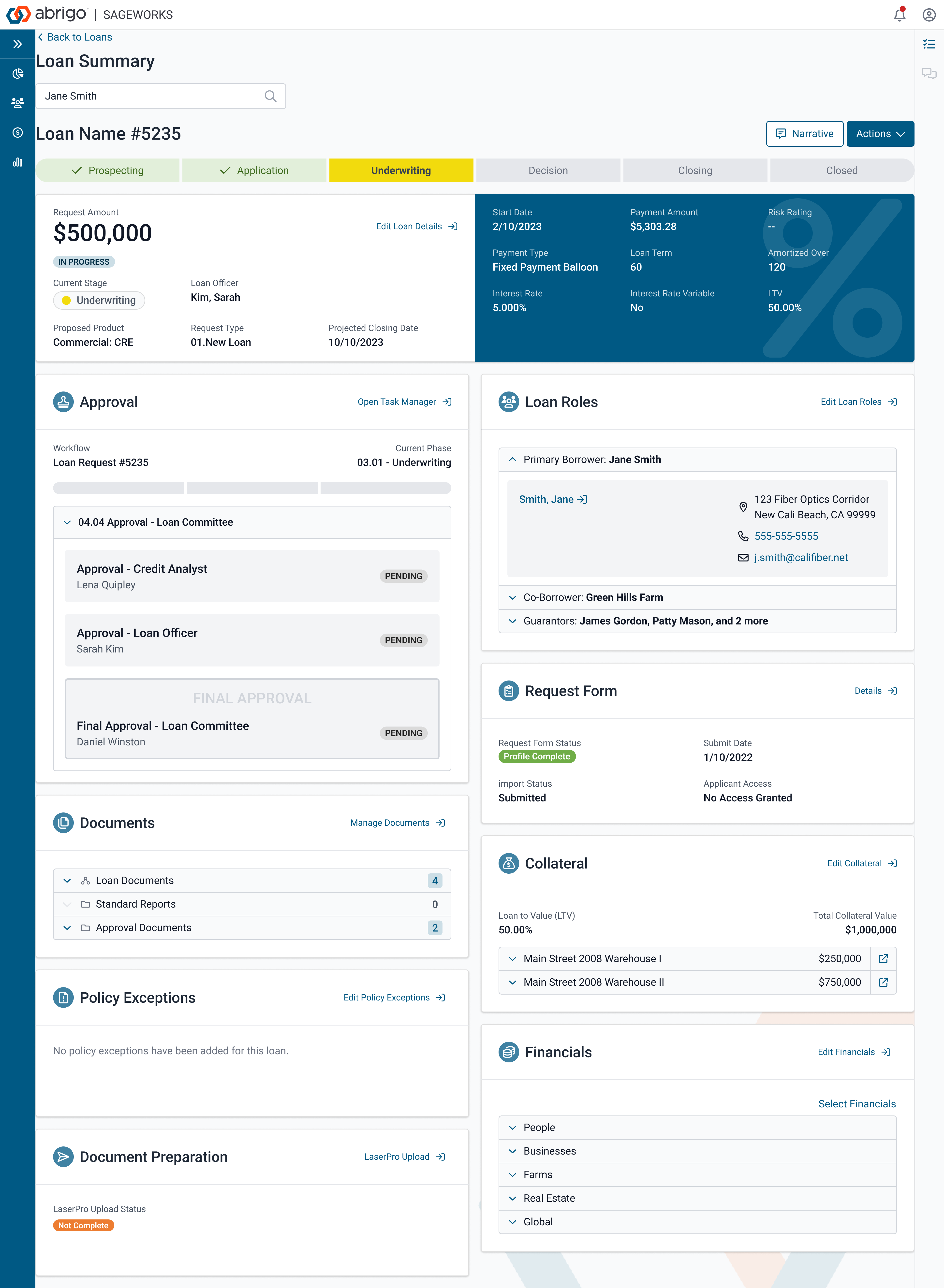
An example of a summary with a different setting. All these designs are high-fidelity designs made in Figma. These examples were used to build a high-fidelity working prototype to do some cognitive walkthroughs with users.
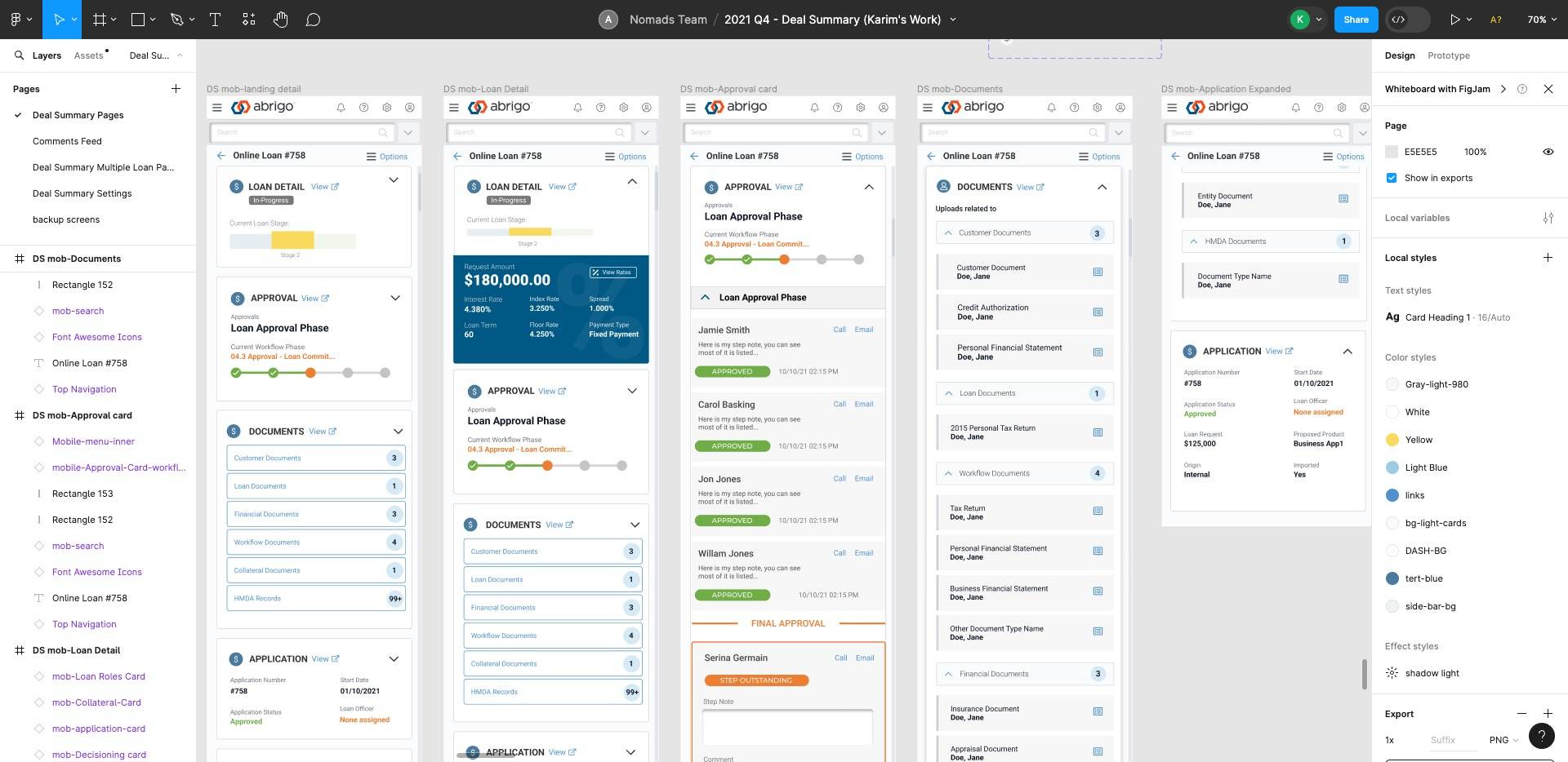
Usability testing was also done for mobile users since this interface is more likely to be used on the field by agents to make some important decisions. We have designed a slightly adaptive UI, but mostly natively responsive using a grid system for different breakpoints.
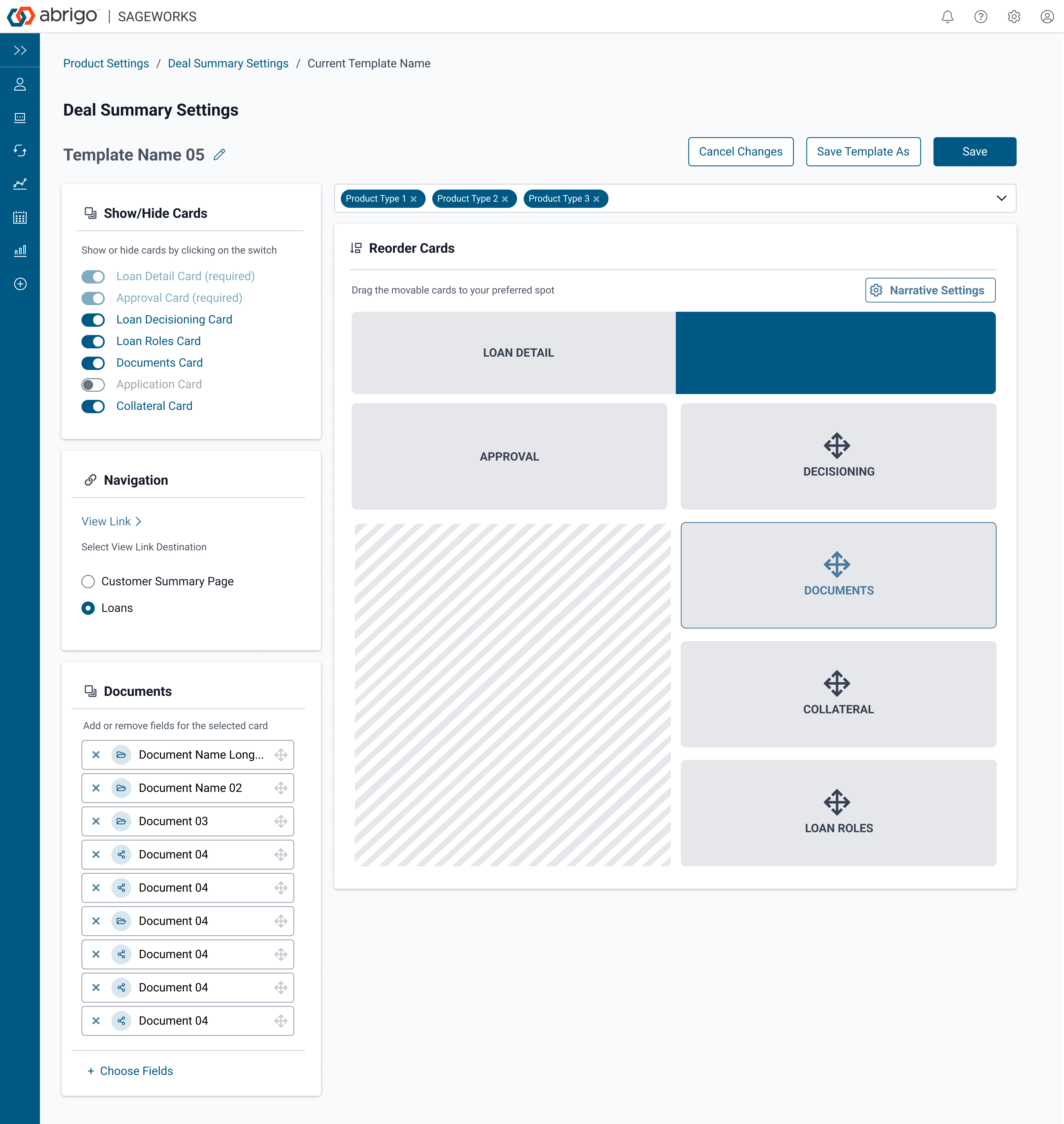
This is the Summary settings page design. Admin users will use the interface to setup the cards on the summary for the different types of products.
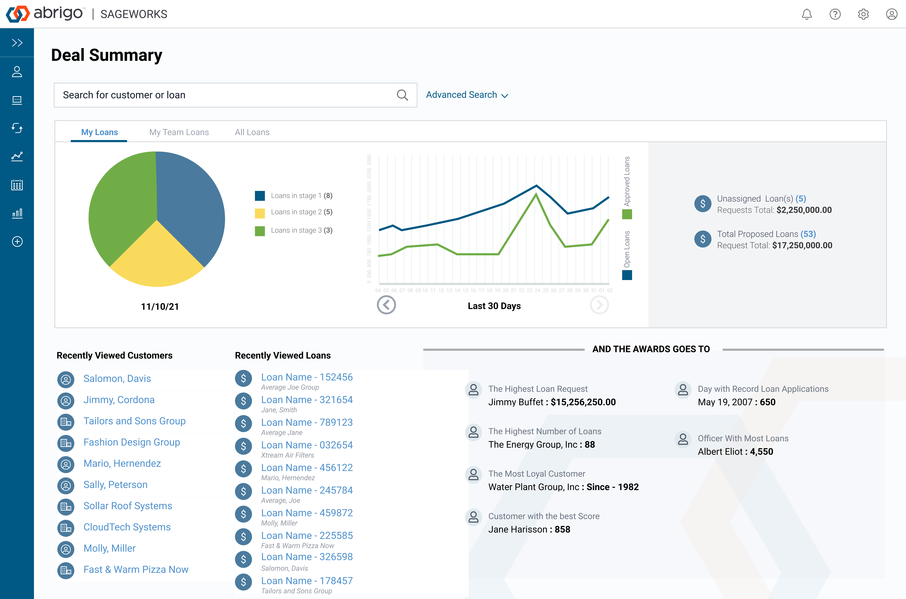
The homepage that the user sees when logging in is the one below. We designed it with the user in mind. It is personalized to each user to give them snapshots of the products they have been working on and the ones they need to pay attention to. From this page, they most likely will land on the summary that we have listed above.