On this section, I will showcase a couple of different approaches to displaying lists of data. In some cases, a table is more suited due to the native table functionality to sort, align, and offer a better comparative view to the user, in others a responsive minimalistic list has performed better with users.

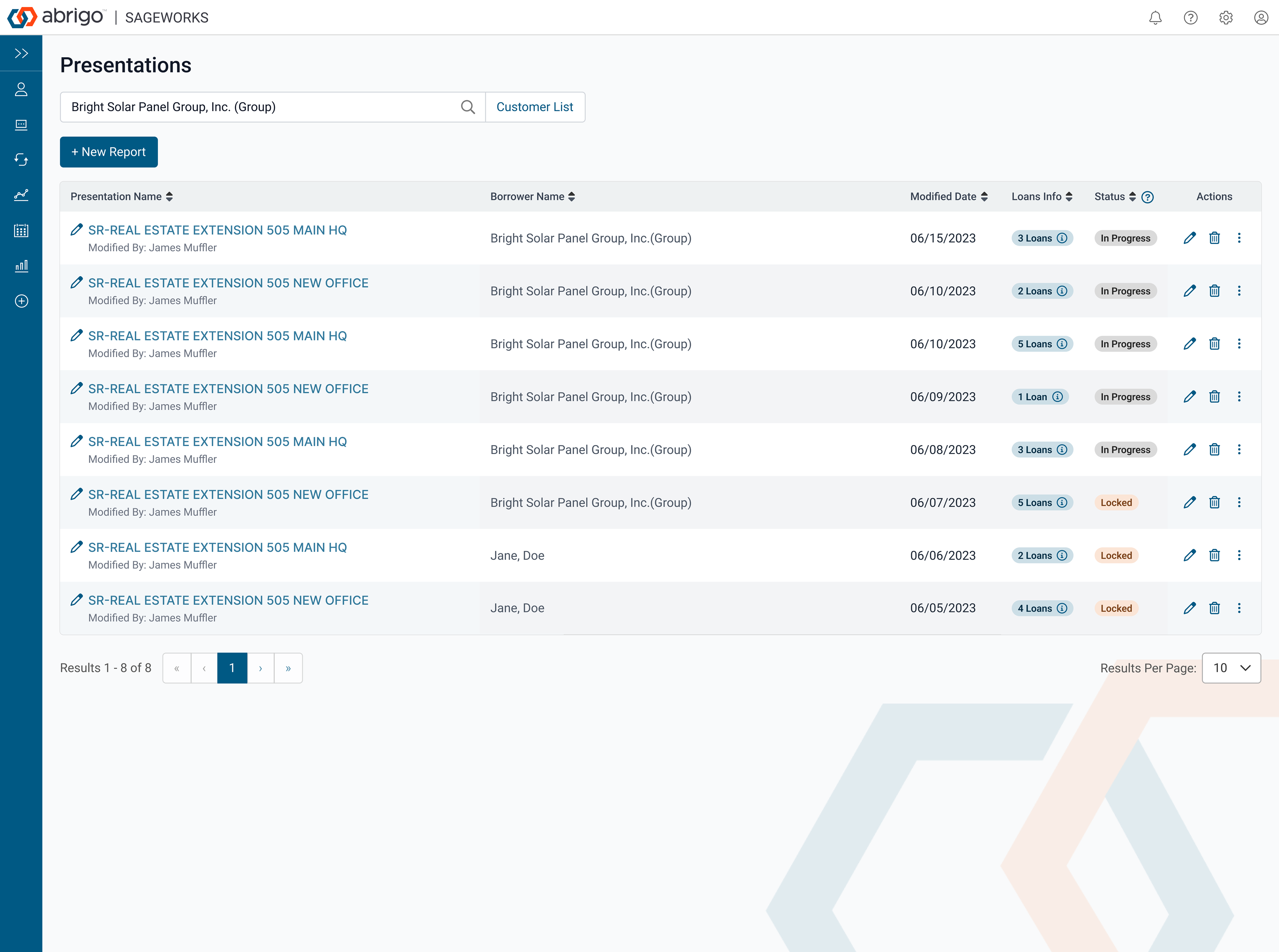
This is another example of a table with some mix of data types to make the table convey more than values, but actions progress and status.
This is a sort of hybrid approach using cards and lists inside the card with some actions for the user to download reports.

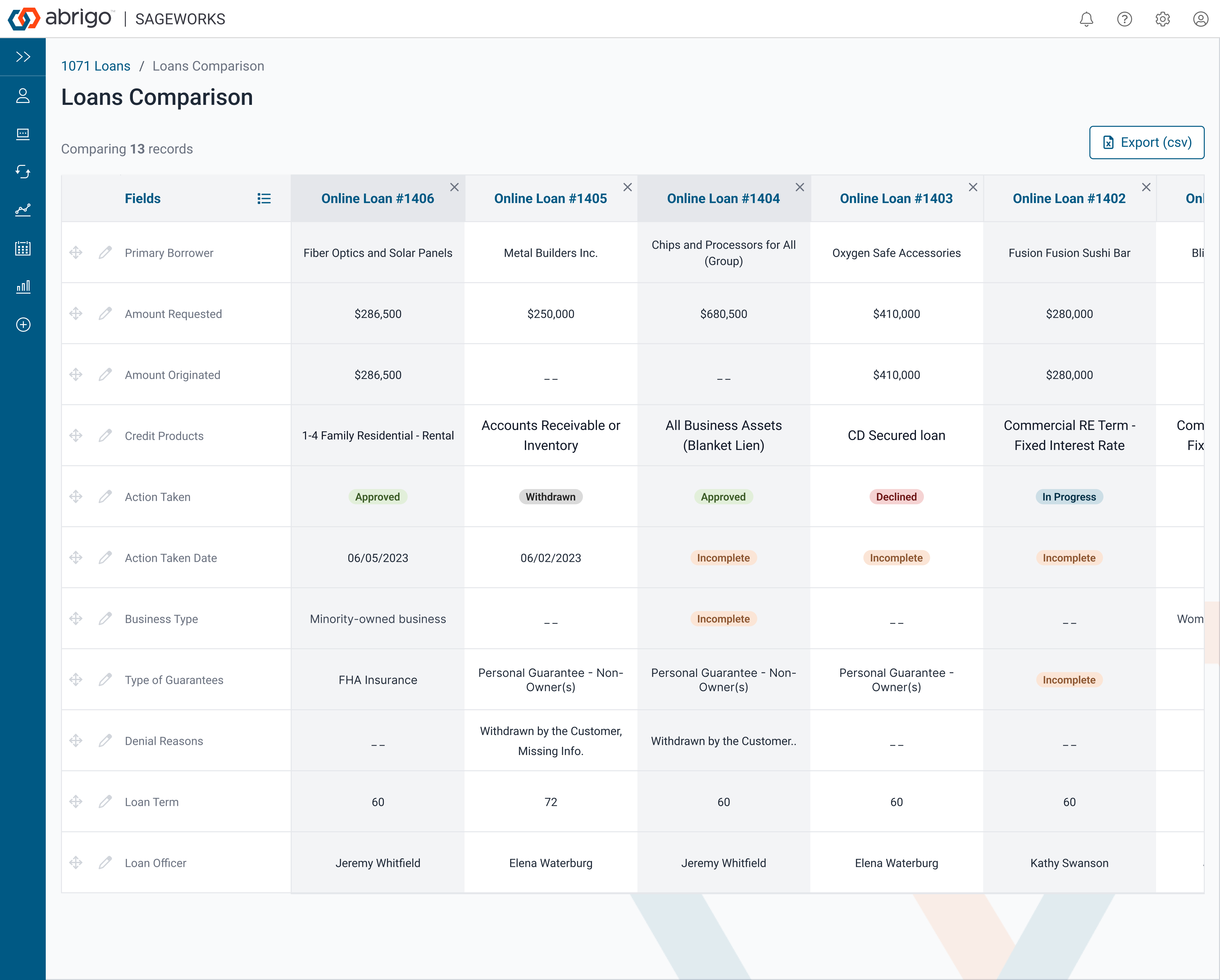
In this example, we notice that there is more data on the right that a user can access by scrolling or swiping their mouse horizontally to compare data across these records.
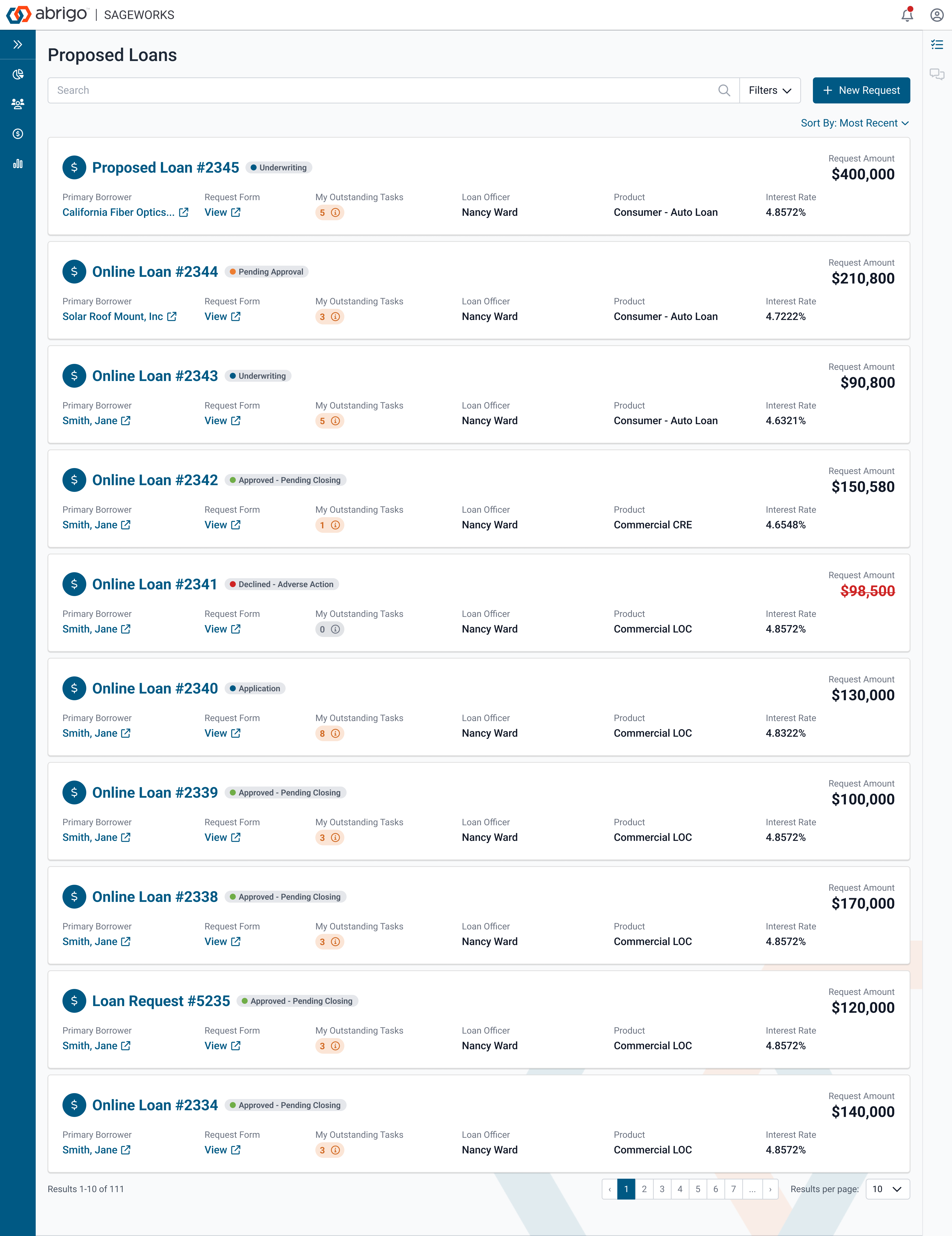
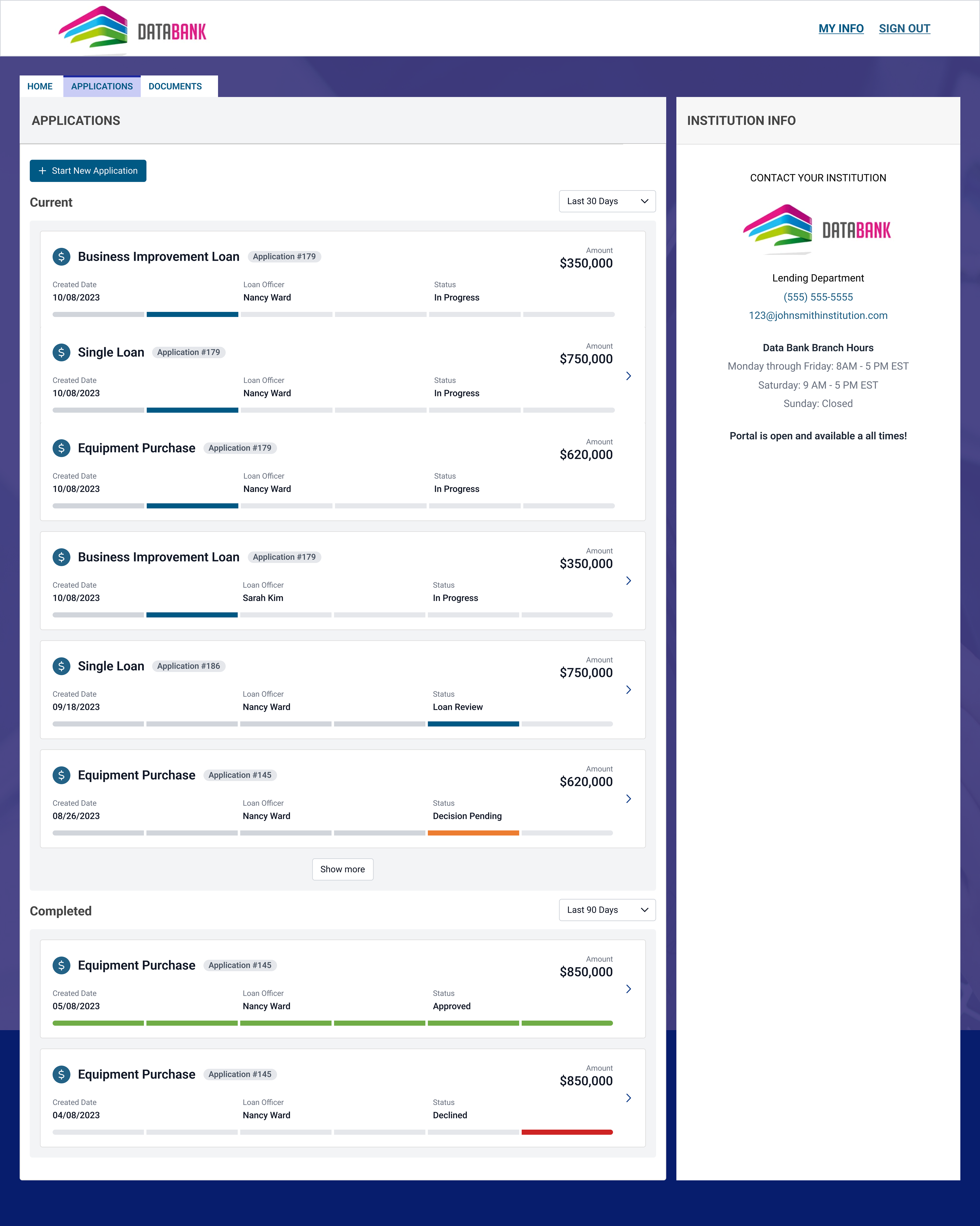
In this example, we have redesigned this interface after testing with users. This was a traditional HTML table that needed too many columns. Users liked this redesign due to how exhaustive the cards are for each record.
Another example of a list here shows status and progress in a more responsive stacked card design.
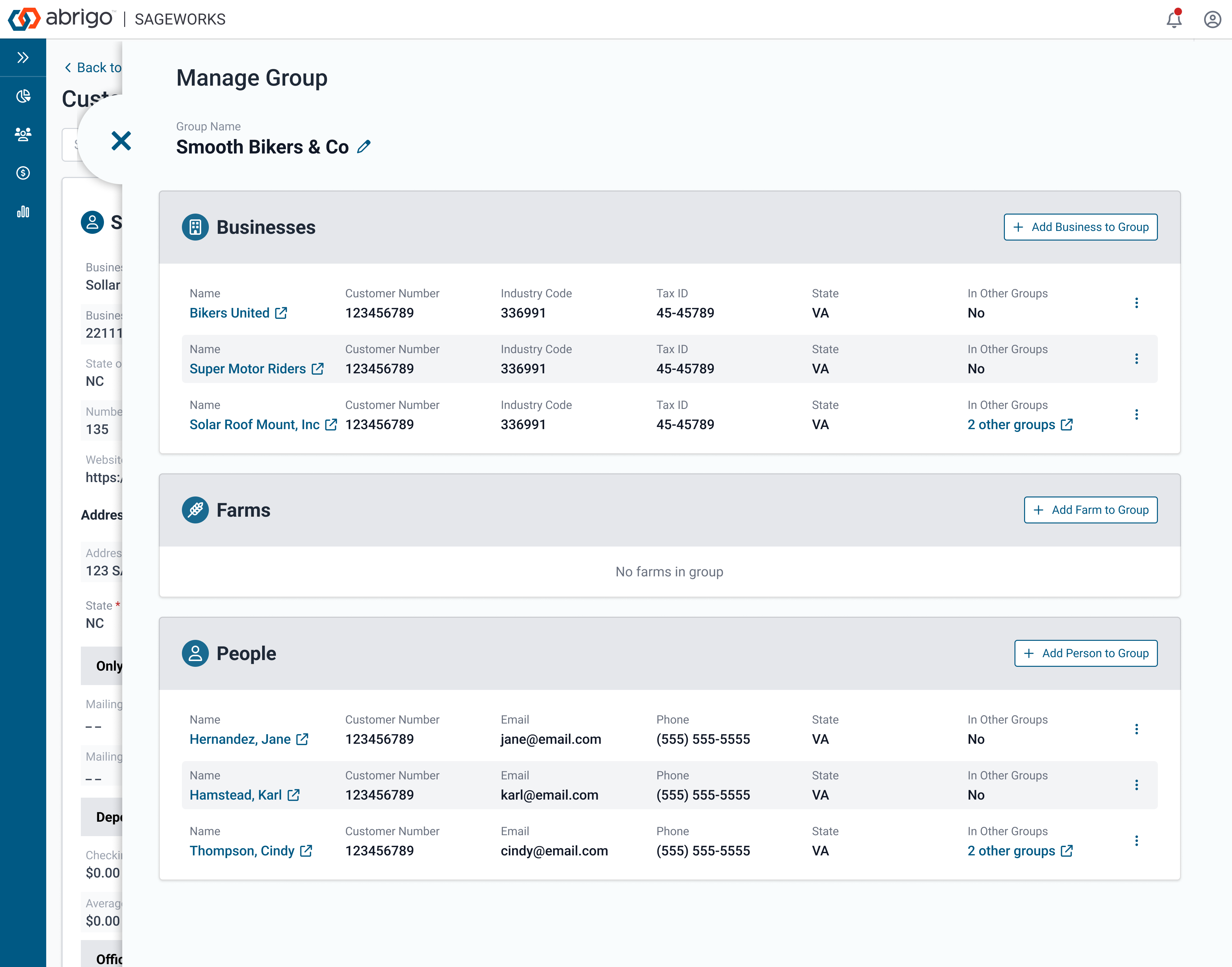
Similarly, in the example below, the small lists are grouped to create a better separation. The header acts as a card header but the lists inside are similar to a table row. The design approach here is to have the labels inside to allow a better responsive flow.